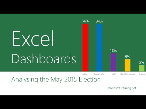
Creating an Excel Dashboard – Election Special Video
What is an Excel Dashboard?
Dashboards are essentially reports in Excel that help you visualise and analyse complex pieces of data.
In the following video we look at an example Excel dashboard to guide us through the mind boggling data being produced by the current UK general election.
[If you interact with the embedded video above and your browser is set to allow cookies, you agree for this 3rd party service to create and store local 3rd party cookies on your device.]
A further look at Excel Dashboards
Why use dashboards?
We can store a huge amount of data in Excel but it is not very easy in a large worksheet to quickly get the information we need. This is where an Excel Dashboard can be a very efficient and time saving option. Once a dashboard is created in the right way it can be easily amended.

Top 5 reasons for Dashboards
We need dashboards to:
- Visualise data
- Spot patterns and trends
- Improve appearances
- Make the numbers more digestible
- Provide interactive selective reporting
How should an Excel dashboard be created?
Before creating a dashboard, you need to spend some time planning. What is the objective and who is your audience? Make sure that your audience can get the information they need from your dashboard.
Ask yourself: “What do I need to track in the dashboard”? Try to get a clear picture of what you are trying to accomplish.
When creating a dashboard, think about how the dashboard will be viewed to make it meaningful for your audience. Some may need a clean, compact dashboard with simple visualizations. Others may want to be able to use more complicated tools and more sophisticated visualizations to dig deeper into the source data.
Dashboards should always be created in a way that data can be added or removed from the source data without time consuming updating of ranges, functions and other Excel tools used in the Dashboard.
Interactivity is an important part of a dashboard.

By adding interactivity such as drop down lists the dashboard can be very dynamic and feed us with even more useful information.
Excel has many statistical tools which can supply us with important information in the dashboard such as trend analysis, forecasting, rank, correlation, average and much more.

KPI’s are another very useful ingredients in a dashboard to visualize the performance.

Additional Resources
As you can see creating an Excel dashboard is really a combination of Excel skillsets. These include pivot tables, chart creation, filtering data, lookups and plenty more.
The following resources can help you on your way to creating Excel dashboards.
Excel 2013: 3 New Ways To Customise Your Charts