Sparklines are a powerful tool in Excel that allow you to visualise data trends in a condensed chart format. Unlike normal Excel charts, Sparklines are embedded in a single cell, making them ideal for displaying trends in sales figures, website hits, and other data over a period of time.
In this blog post, we’ll show you how to create and customise Sparklines in Excel, and provide some examples of how they can be used in different business roles and industries.
For instance, sales managers can use Sparklines to track sales figures over time, while marketing professionals can use them to monitor website traffic. Sparklines can also be used in finance to track stock prices or in healthcare to monitor patient vitals.
There are 3 types of Sparkline available, “line”, “column” and “Win/Loss”:

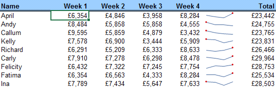
In the following example we see how a sales manager can quickly create Sparklines to easily analyse and compare performance across multiple sales regions.
Creating a Sparkline
Unlike a normal Excel chart that ‘floats’ on top of the spreadsheet, a Sparkline is embedded in a single cell. Create a Sparkline for Region A figures Jan-Oct as follows:
- Select a cell to the right of the data you want to visualise – see below:

2. Go to INSERT > SPARKLINES > LINE
3. In the ‘Data Range’ field, select all the cells containing numbers to the left of the selected cell. Click OK to display the following Sparkline

Editing a Sparkline
- To see each point of the Sparkline more clearly, go to SPARKLINE > SHOW > HIGH POINT.
Note the same values of 28 for both March and July give rise to 2 red markers on the Sparkline.
![]()
Reducing the July figure to 26 would result in just one marker for March – see below:

2. Reducing the July figure to 26 would result in just one marker for March – see below:

3. Now change the August figure to -5 and then change the type to WIN/LOSS
4. Untick ‘High Point’ and tick ‘Negative Point’
5. Select a different Sparkline style to reflect RAG status colours (Red, Amber, Green) i.e. Red (negative values) and Green (positive values)
Note the main purpose of the WIN/LOSS Sparkline is to show which values are positive or negative – see below.

6. Change the type back to the default ‘Sparkline’ and set the following:
a. Tick ‘High point’ and ‘Low point’
b. Untick ‘Negative points’
c. Sparkline colour to blue.
Copying a Sparkline
Once you have created a Sparkline, all its attributes can be copied down to represent other rows of data:

The result is shown below:

2. To edit the Sparklines, select any one within a single cell, do the edits and all of them will be changed as a group
3. If you want to change one specific Sparkline without affecting the others, go to SPARKLINE > GROUP > UNGROUP
Deleting Sparklines
Unlike for normal charts and data generally, the delete button will not work for deleting Sparklines.
Select the Sparklines and go to SPARKLINES > GROUP > CLEAR > CLEAR SELECTED SPARKLINES
Conclusion
In conclusion, Sparklines are a great way to visualise data trends in Excel, and can be used in a variety of business roles and industries. By following the steps outlined in this blog post, you can create and customise Sparklines to better understand your data and make more informed decisions.